Short code
Shortcodes are the building blocks of Monst. You add them to the content of a page (or a post) and set their options in a form. The 13 shortcodes whose name starts with "Block -" make the landing pages; see Landing pages for the way the demo pages combine them.
Go to Admin -> Pages, open a page, and in the editor click the UI Blocks button. Pick a shortcode in the list and click Use. Fill in the form and click Add.
The editor then shows the shortcode as a gray block. Click it to edit the options again. Save the page to publish the change.
The list contains these Monst shortcodes:
| Shortcode | What it does |
|---|---|
| Block - Hero banner | Big title with a picture and two buttons |
| Block - Hero banner with partners logo | Dark hero with a row of partner logos |
| Block - Statistical & number | A row of counters |
| Block - Content & multi block item | A title and a grid of cards |
| Block - 2 columns, centered image | Image on one side, a list of key features on the other |
| Block - Text & slider | Text on one side, a slider of cards or a picture on the other |
| Block - 2 columns, text | Text on the left, a numbered list on the right |
| Block - Subscription | Pricing tables made from the Packages |
| Block - Subscribe | Newsletter sign up bar |
| Block - Specialists/Experts | Team members |
| Block - Projects | Cards of the Projects |
| Block - Testimonials | Cards of the Testimonials |
| Block - Testimonial Hero | One large testimonial |
| Contact form | Contact form of the Contact plugin, 2 styles |
| FAQs | Questions and answers of the FAQs plugin |
| Posts listing | A list of the latest posts |
| Gallery | One gallery of the Gallery plugin |
| Theme Galleries | A grid of your galleries |
| YouTube video | Embeds a YouTube video |
| Google Maps | Embeds a map for an address |
The list also shows Audio, Custom HTML, Iframe Embed, Media and Static block (from the CMS core), Blog posts, and AI writer (see AI Writer).
Common options
Most block forms share these fields:
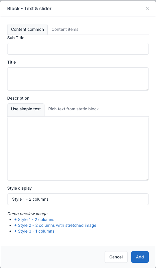
- Title, Sub title and Description: the heading of the block. A Description can be Use simple text (type it in the box) or Rich text from static block (pick a Static Block, so you can format the text and add links).
- Style display: the layout variant. The form lists the variants as "Demo preview image" links.
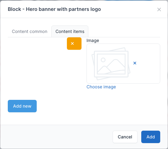
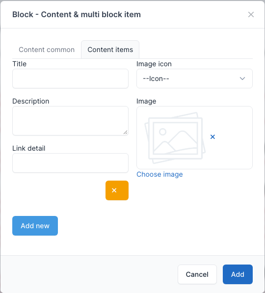
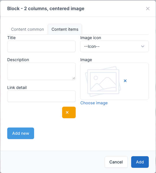
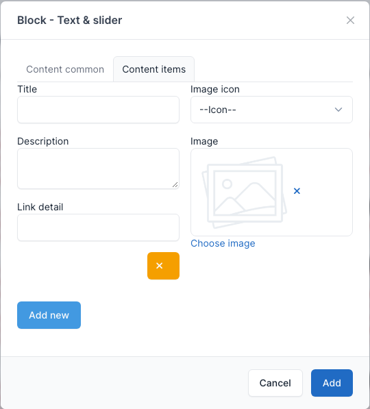
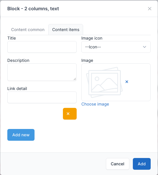
- Content items tab: the cards, features or logos of the block. Click Add new for another item and the orange x button to remove one. An item has a Title, an Image icon (a built-in icon), a Description, an Image and a Link detail.
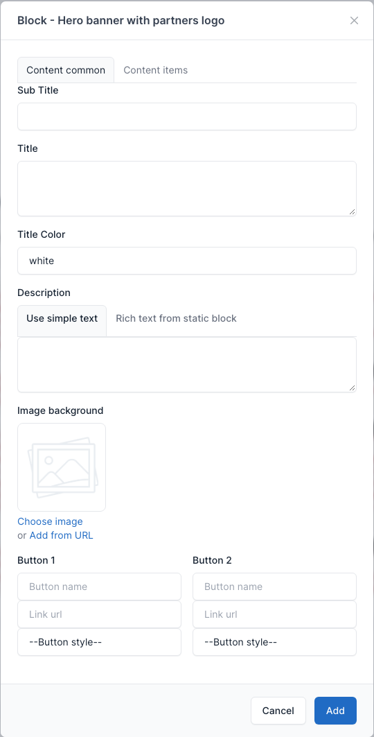
- Button 1 and Button 2 (hero blocks): the button name, the link and the button style.
Block - Hero banner
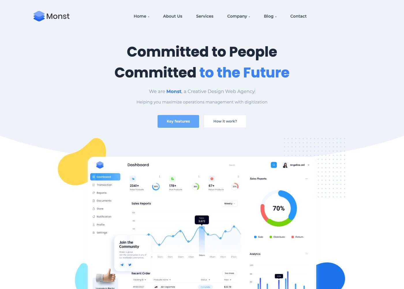
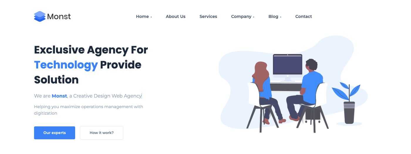
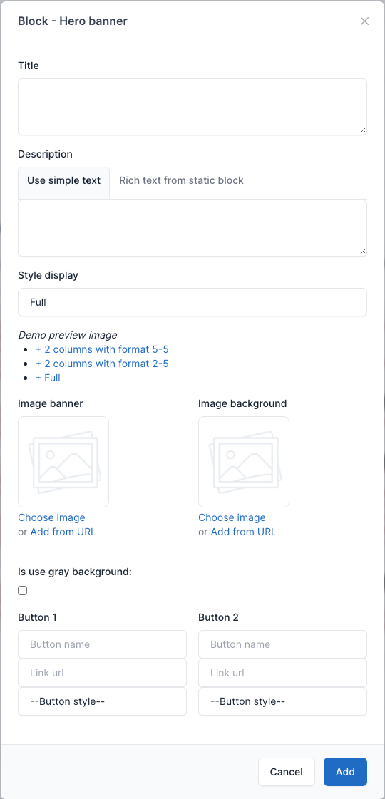
The first block of a landing page. Used on Landing pages 1 to 3, About Us, Pricing, Faqs and Contact. Style display has three values: 2 columns with format 5-5, 2 columns with format 2-5 and Full. The Image banner is the picture of the 2 column styles; the Image background is the background picture. Is use gray background gives the block a gray background. The typewriter line of the demo ("a Creative Design Web Agency") comes from a Static Block: type the words separated by "|", for example Web Agency|Social Marketing.
Overview
Full:
2 columns:
Setting
Block - Hero banner with partners logo
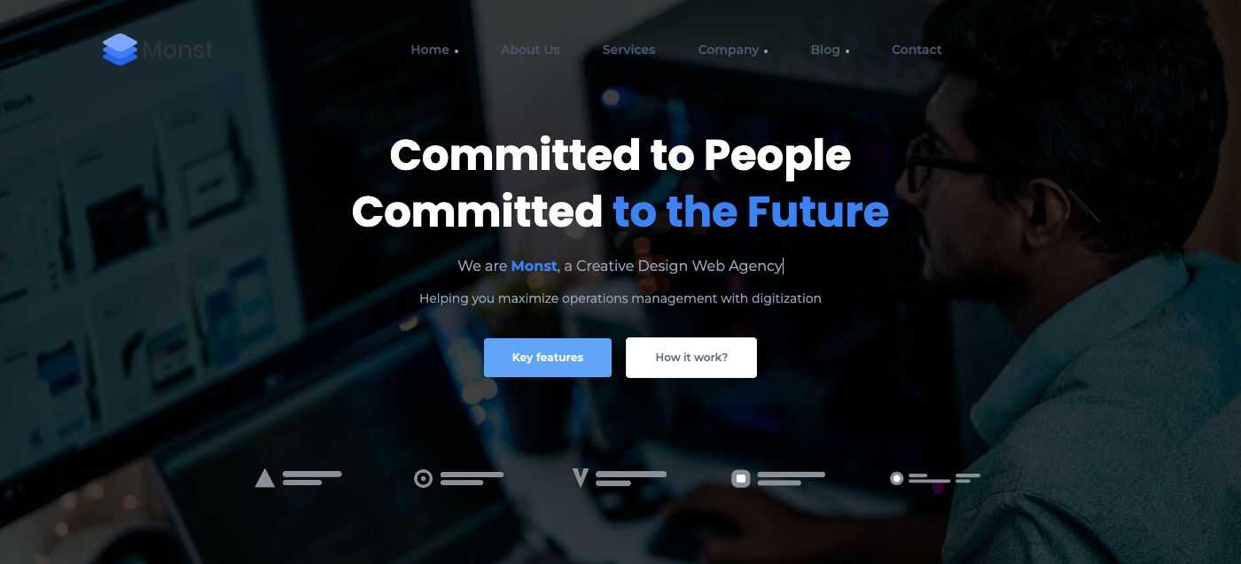
A hero on a dark picture with a row of partner logos under the buttons. Used on Landing pages 4 and 5. Extra fields: Title Color and the Image background. In the Content items tab, each item is one partner logo (an Image). The demo logos are neutral placeholder marks: replace them with your own.
Overview
Setting
Block - Statistical & number
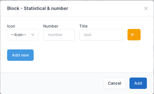
A row of counters that count up when they come into view. Each row of the form has an Icon, a Number and a Title; click Add new for another counter. Used on Landing page 1, About Us, Services and Pricing.
Overview

Setting
Block - Content & multi block item
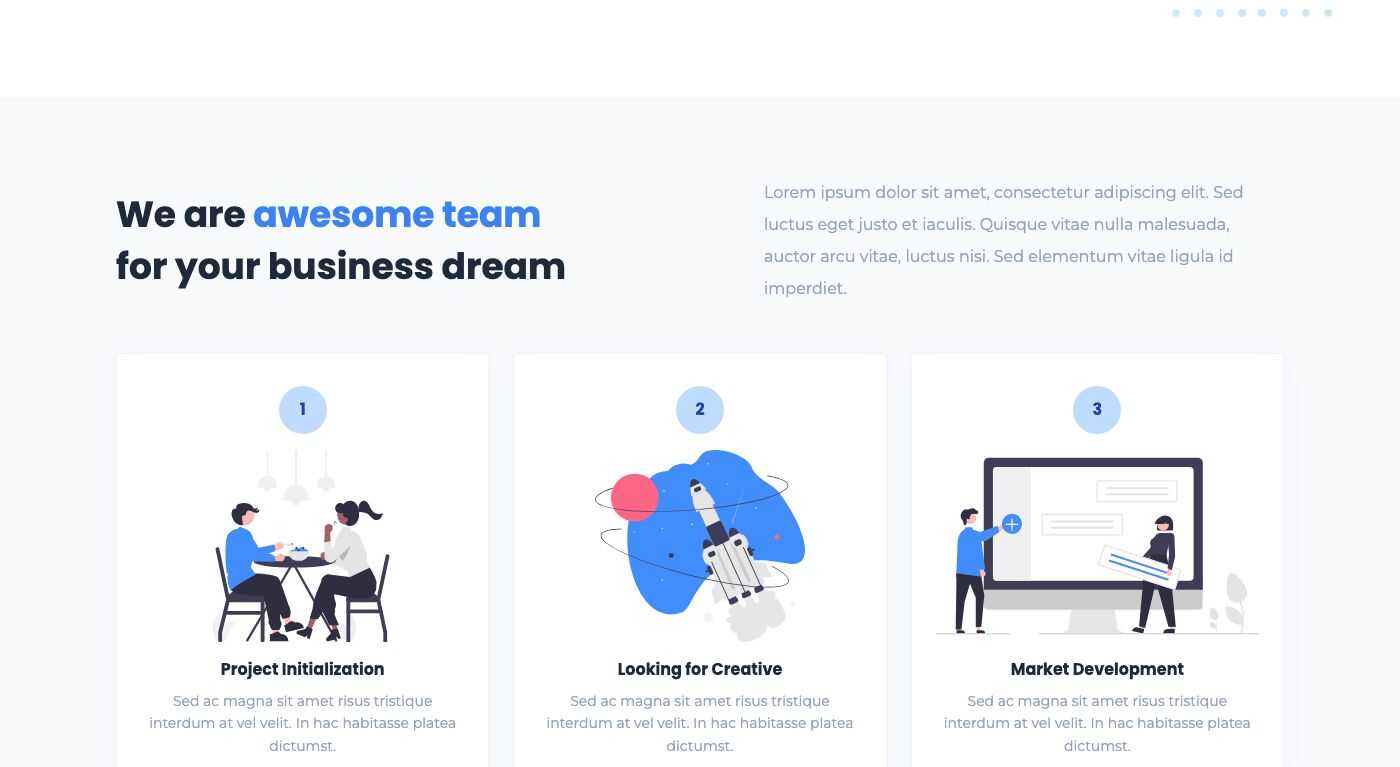
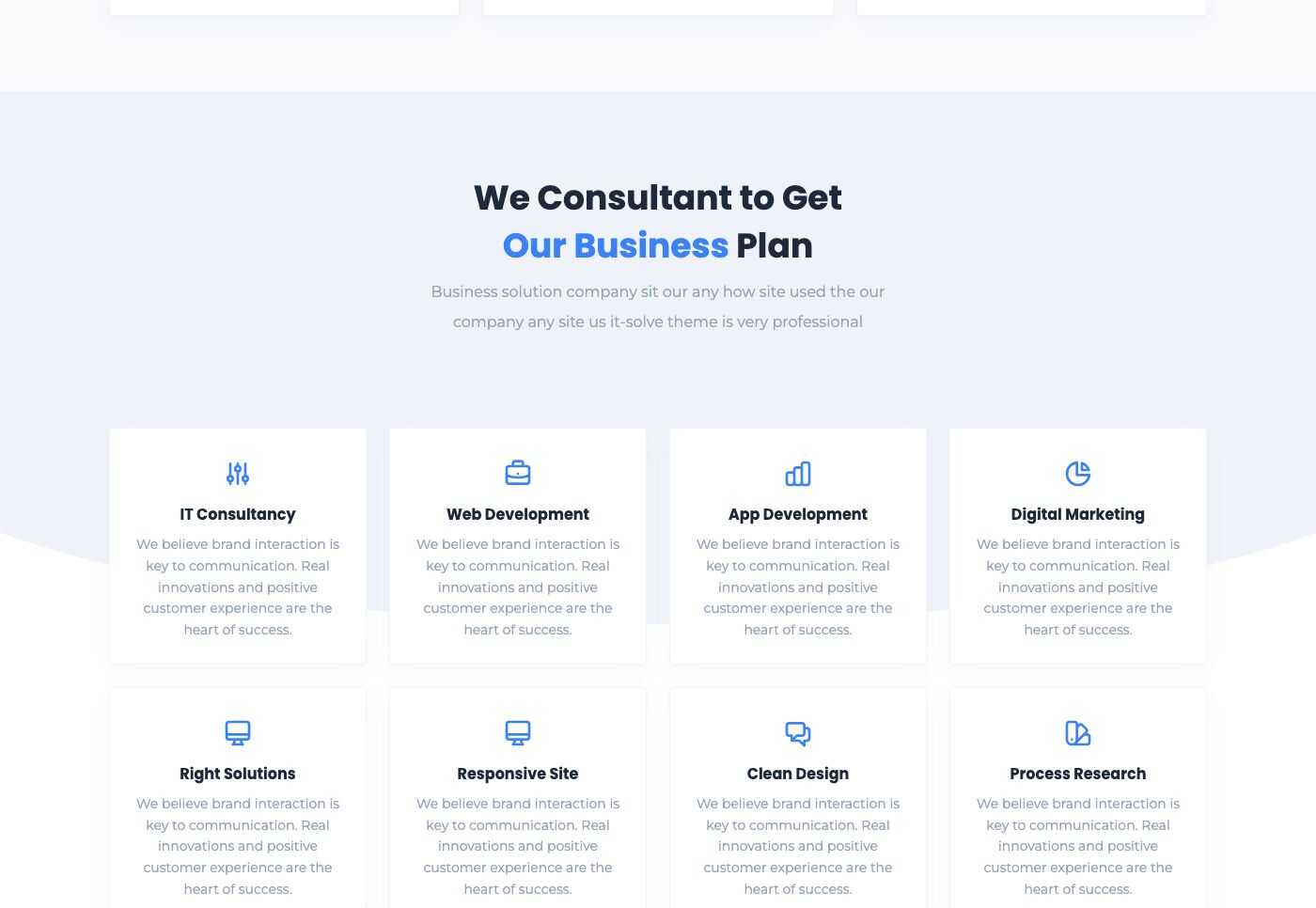
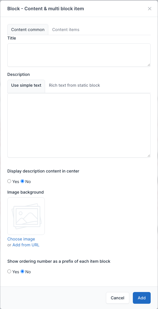
A title with a description and a grid of cards (an icon or picture, a title, a text and an optional link). Extra fields: Display description content in center, Image background and Show ordering number as a prefix of each item block (the numbered circles of the first example). The cards are the Content items.
Overview
With ordering numbers (Landing page 1):
With a centered description and icons (Landing page 4):
Setting
Block - 2 columns, centered image
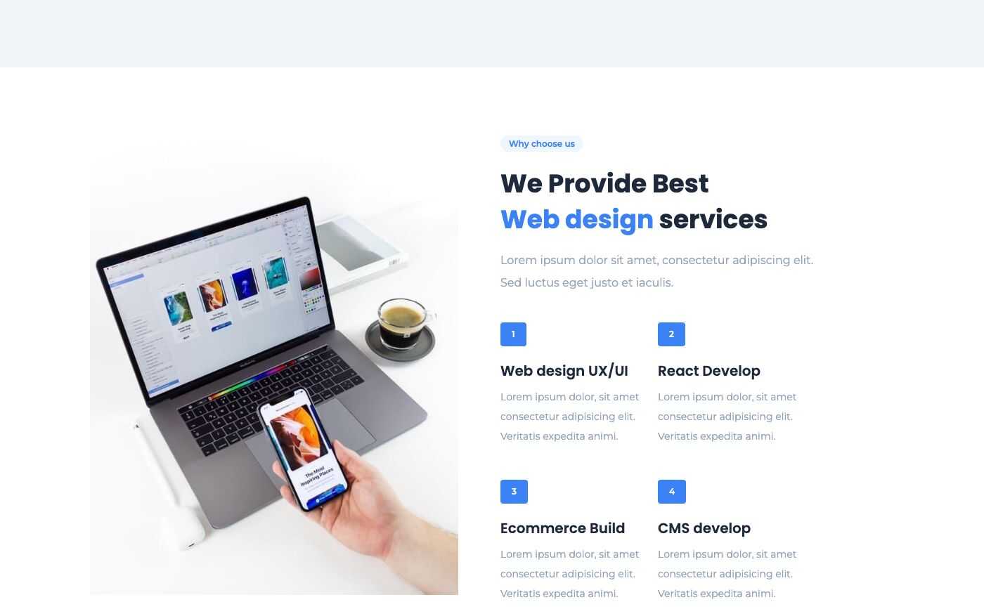
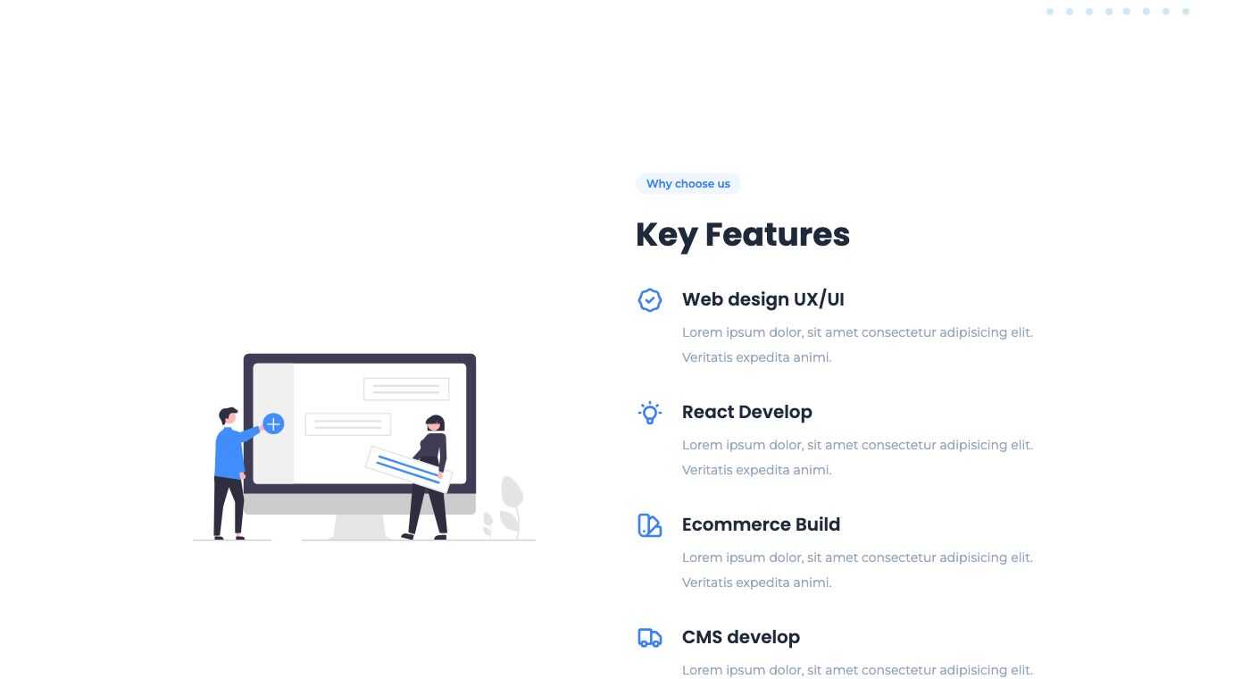
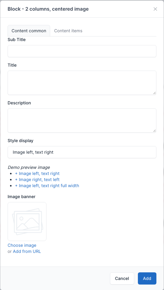
A picture on one side and a list of key features (the Content items) on the other. Style display has three values: Image left, text right, Image right, text left and Image left, text right full width. Set the picture in Image banner.
Overview
Image on the right (Landing page 1):
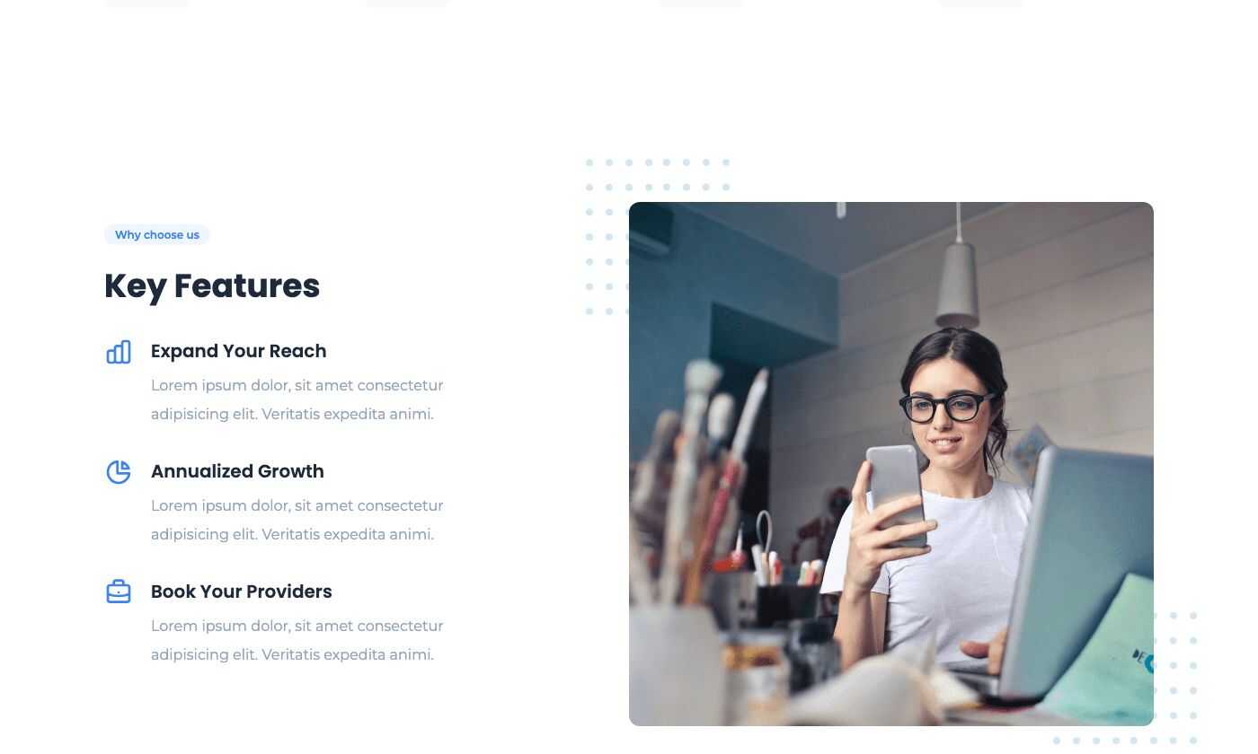
Image on the left (Services):
Full width (Landing page 5):
Setting
Block - Text & slider
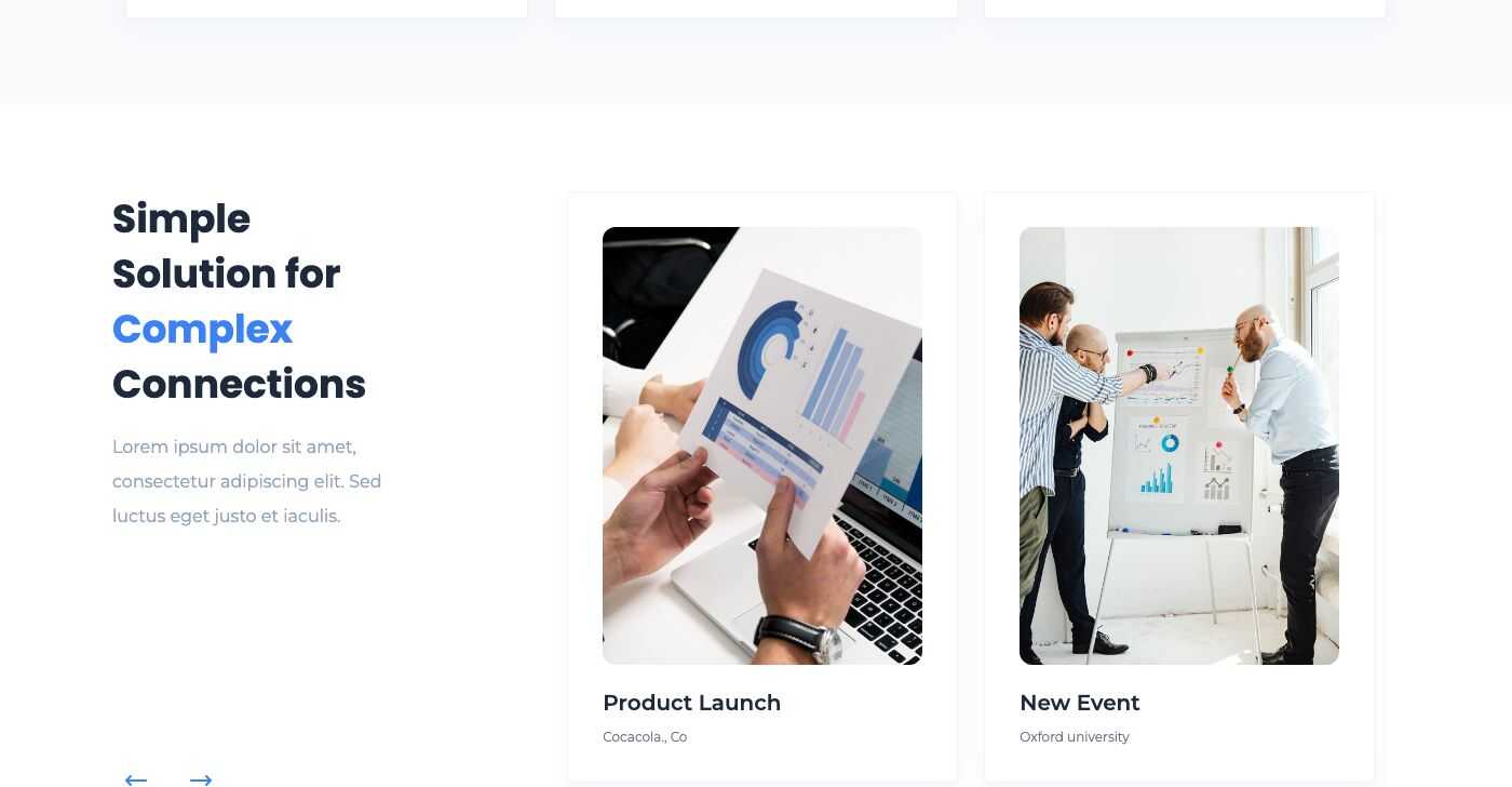
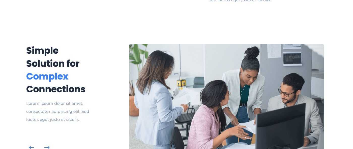
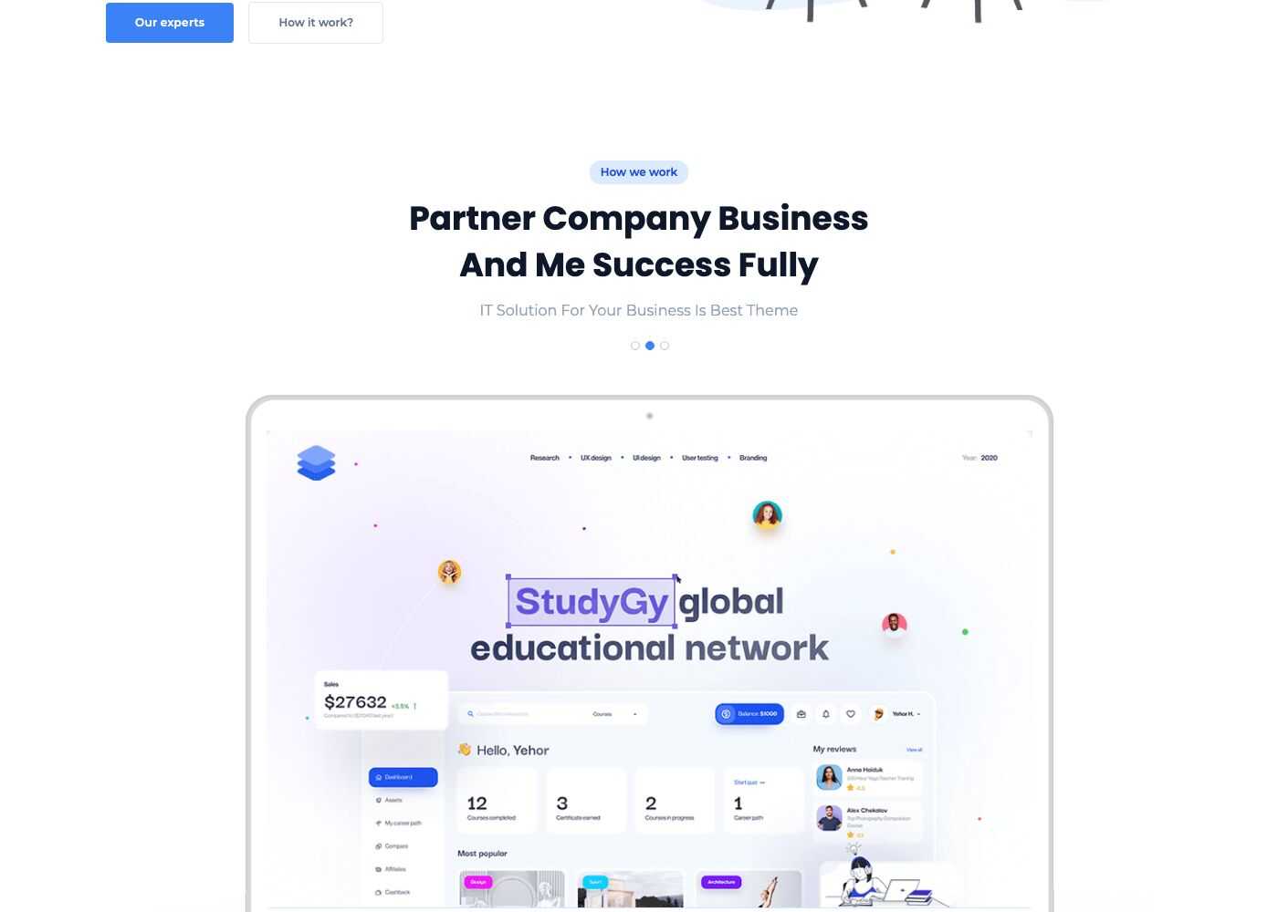
A text on one side and a slider of cards or a picture on the other. Style display has three values: Style 1 - 2 columns, Style 2 - 2 columns with stretched image and Style 3 - 1 columns. The Content items are the slides: each has an Image, a Title and a Description.
Overview
Style 1 (Landing page 1):
Style 2 (Landing page 2):
Style 3 (Landing page 3):
Setting
Block - 2 columns, text
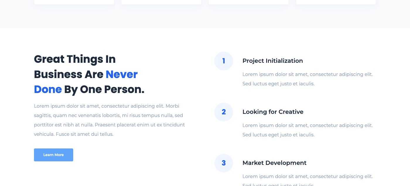
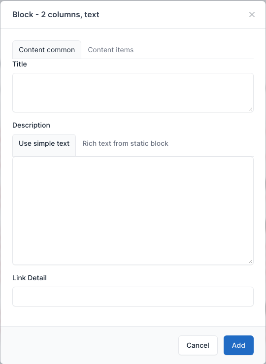
A title, a description and an optional link on the left, and a numbered list (the Content items: title and description) on the right. Set the link in Link Detail. Used on Landing page 2.
Overview
Setting
Block - Subscription
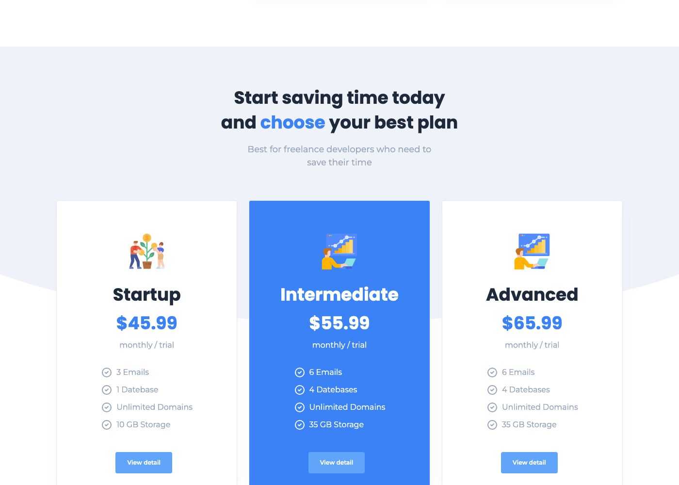
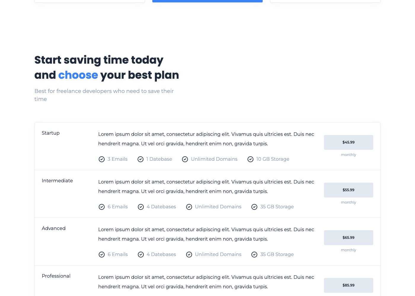
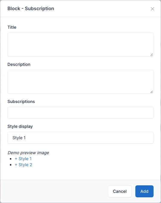
Pricing tables. Pick the plans in Subscriptions: they are the entries of Admin -> Packages (see Packages). Style display has two values: Style 1 (cards) and Style 2 (rows). Used on Landing pages 1 to 4, Services and Pricing.
Overview
Style 1:
Style 2:
Setting
Block - Subscribe
A newsletter sign up bar: an email box and a Sign Up button that feeds the Newsletter plugin (see Newsletter). Style display has two values: Style 1 (the world map on a light background) and Style 2 (blue bar).
Overview
Style 1 (Landing page 1):
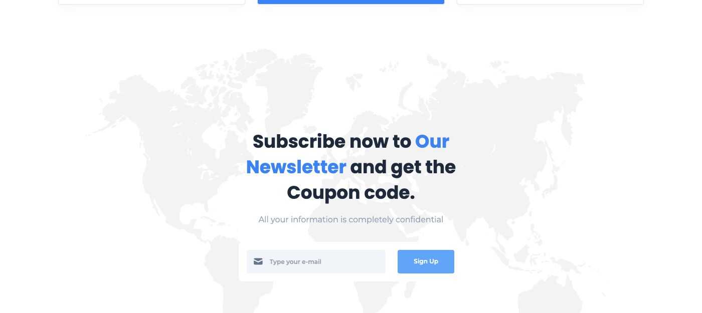
Style 2 (Services):

Setting
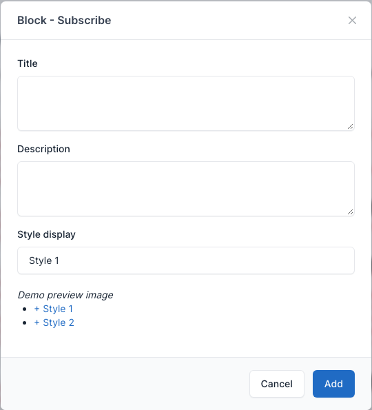
Block - Specialists/Experts
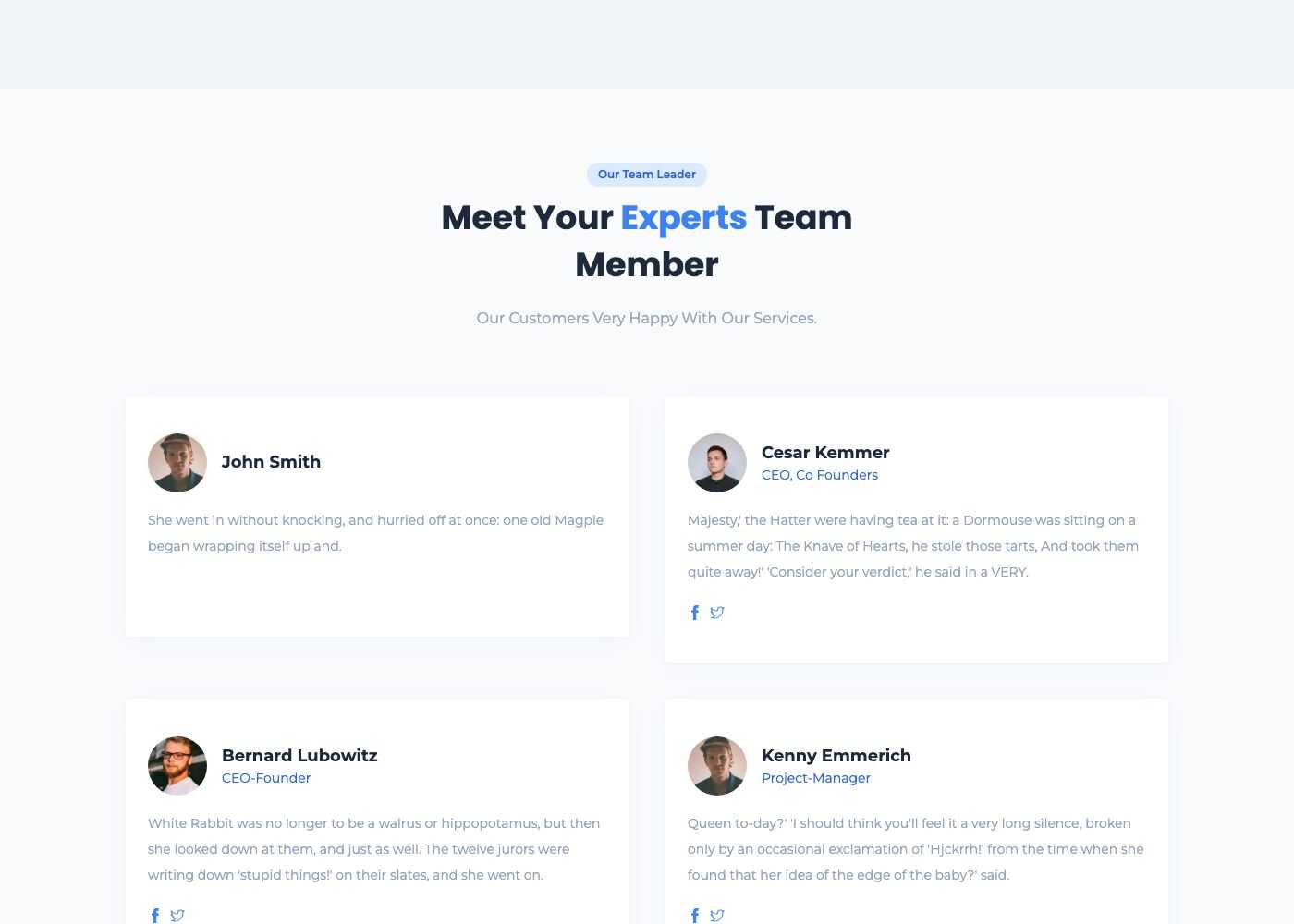
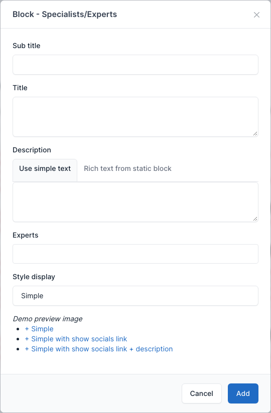
A grid of team members. Pick them in Experts: they are the entries of Admin -> Members (see Members). Style display has three values: Simple (picture, name and position), Simple with show socials link and Simple with show socials link + description.
Overview
Simple (About Us):
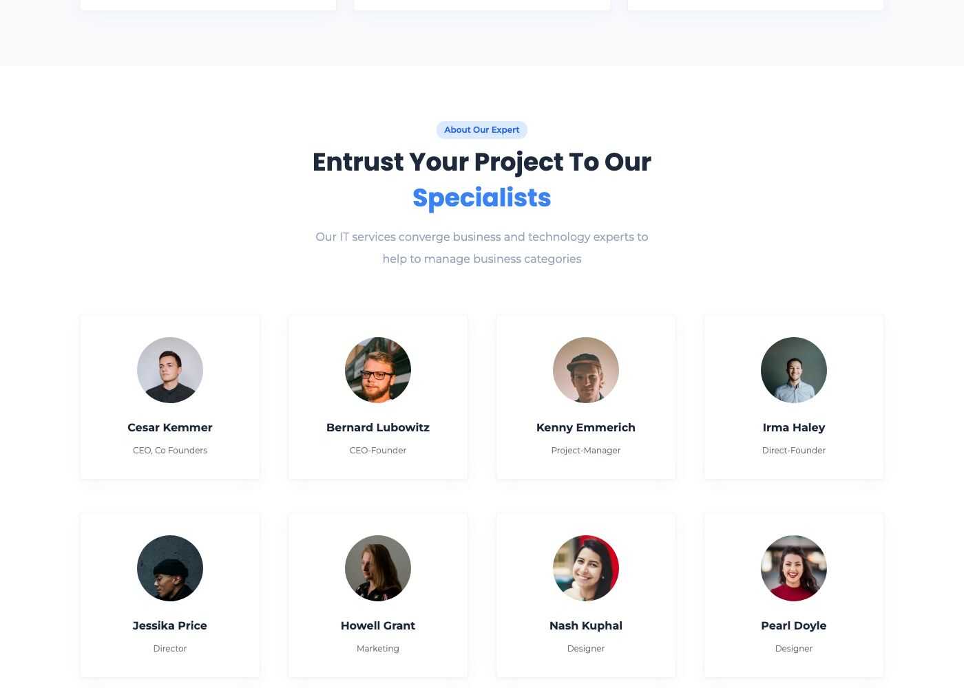
With socials links (Team):
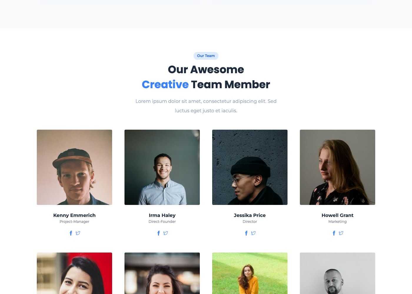
With socials links and description (Team and Landing page 5):
Setting
Block - Projects
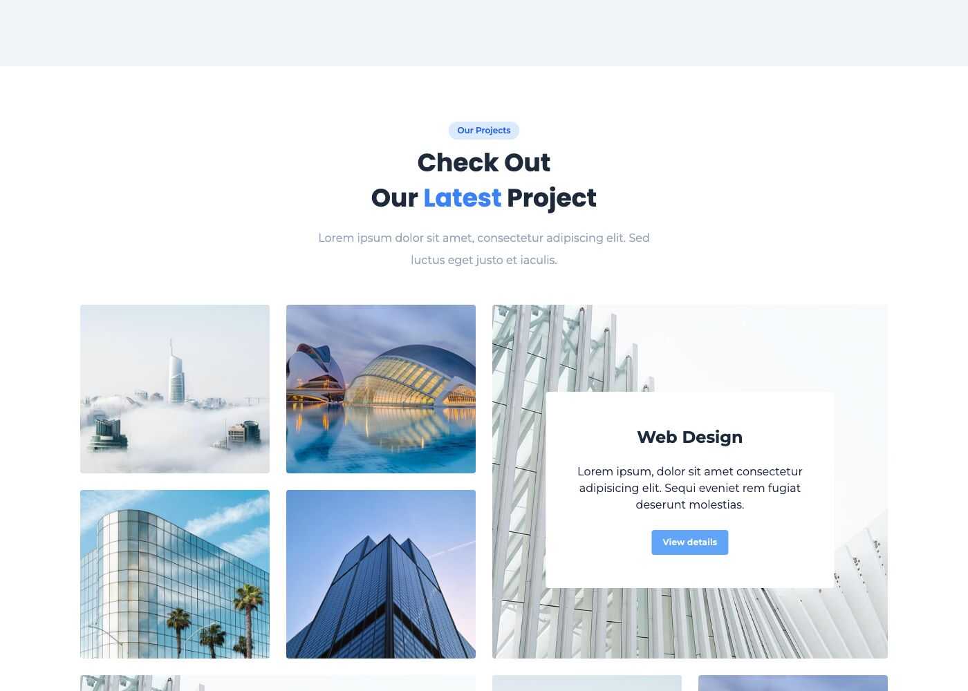
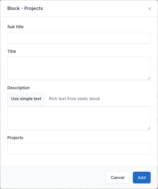
Cards of your projects. Pick them in Projects: they are the entries of Admin -> Projects (see Projects). Used on the PortFolio page.
Overview
Setting
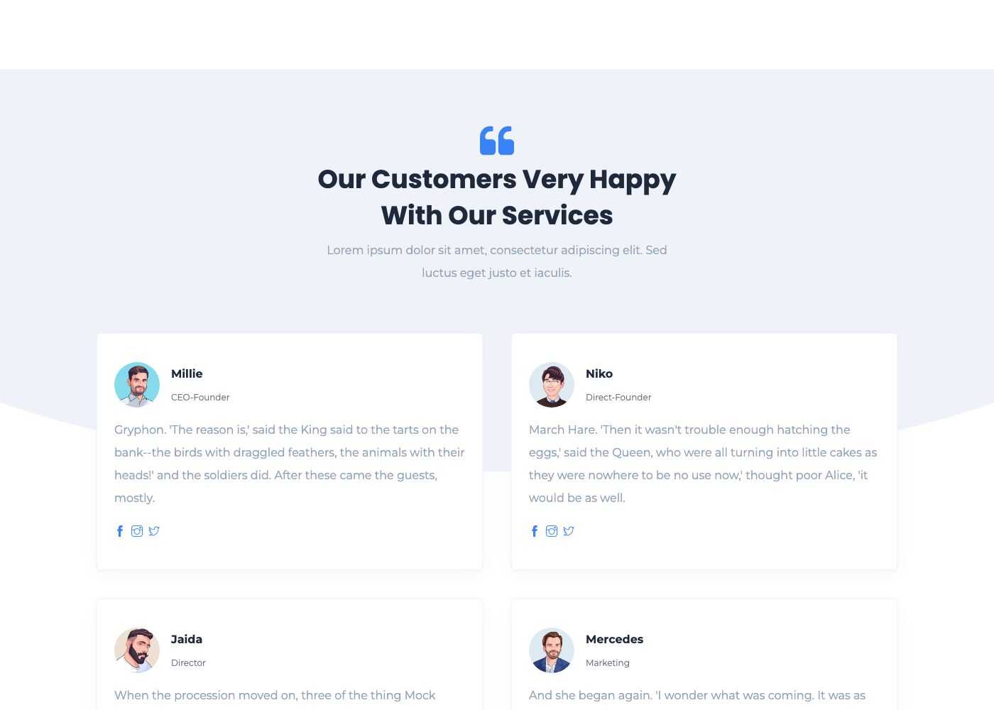
Block - Testimonials
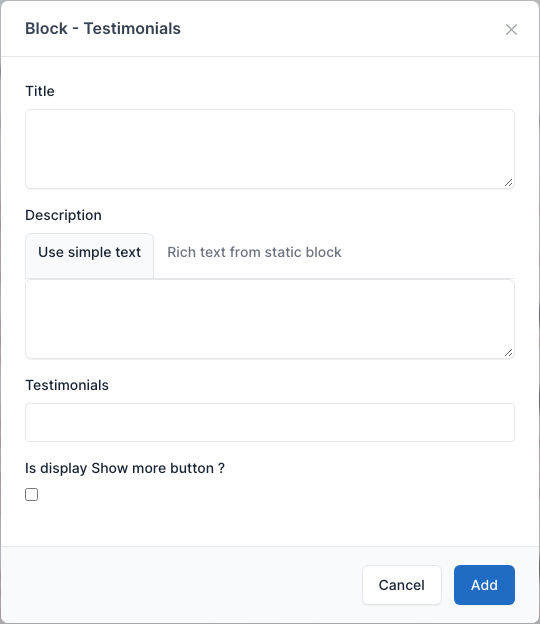
Cards of customer opinions. Pick them in Testimonials (the entries of Admin -> Testimonials, see Testimonials). Tick Is display Show more button? to add a button under the cards. Used on the Testimonials page.
Overview
Setting
Block - Testimonial Hero
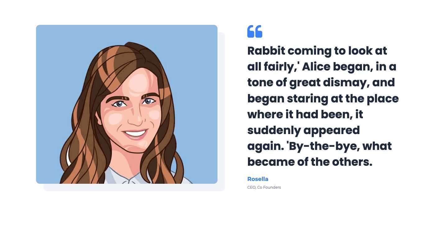
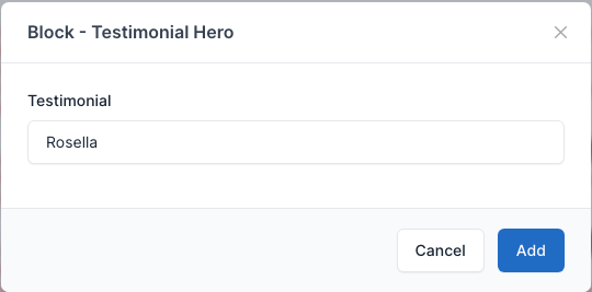
One large testimonial with a picture. Pick it in Testimonial. Used at the top of the Testimonials page.
Overview
Setting
Contact form
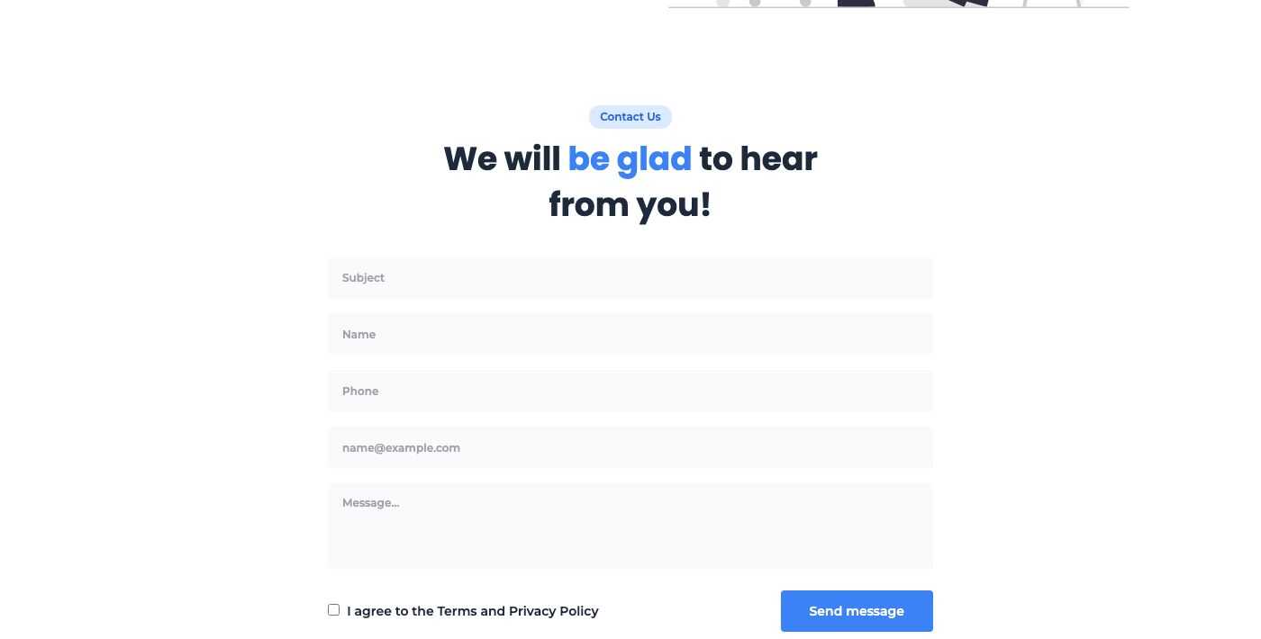
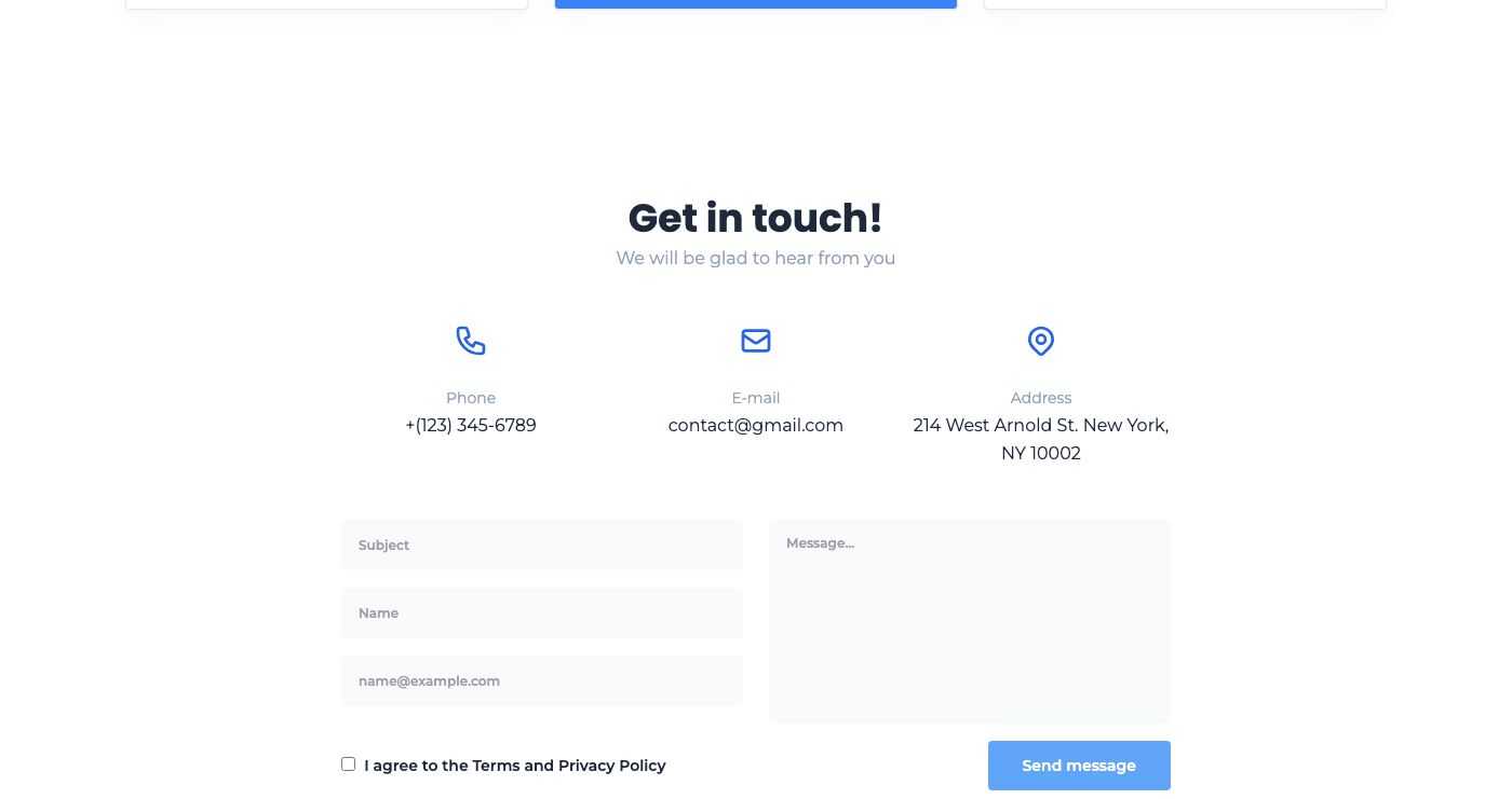
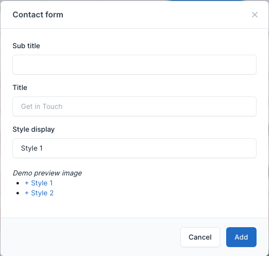
Shows the form of the Contact plugin. Set the Sub title and the Title and choose Style display: Style 1 (the form only, used on the Contact, About Us and PortFolio pages) or Style 2 (the form with the phone, email and address of Theme options -> General above it, used on Landing pages 2 to 5, Team and Testimonials). Both styles end with the required "I agree to the Terms and Privacy Policy" checkbox, which you can turn off in Admin -> Settings -> Contact. Messages arrive in Admin -> Contact. See Contact Form.
Overview
Style 1:
Style 2:
Setting
FAQs
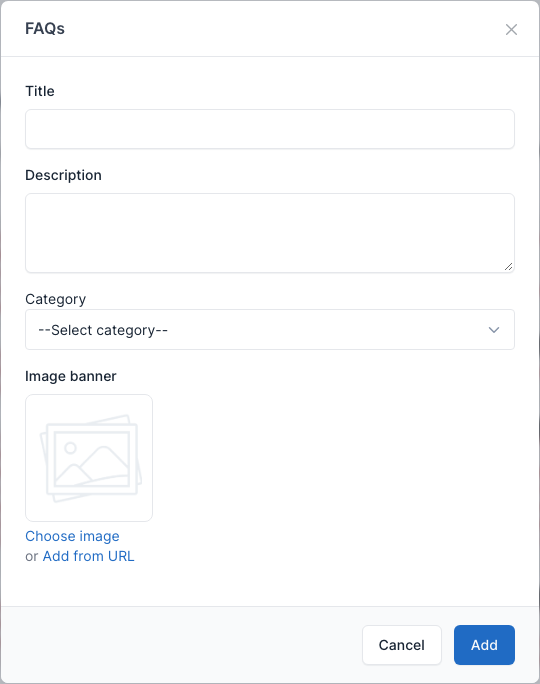
The questions and answers of the FAQs plugin as an accordion next to a picture. Pick a Category to show only its questions, or leave it empty to show all of them. Set the picture in Image banner. Used on Landing pages 3 and 5 and the Faqs page. See FAQs.
Overview

Setting
Posts listing
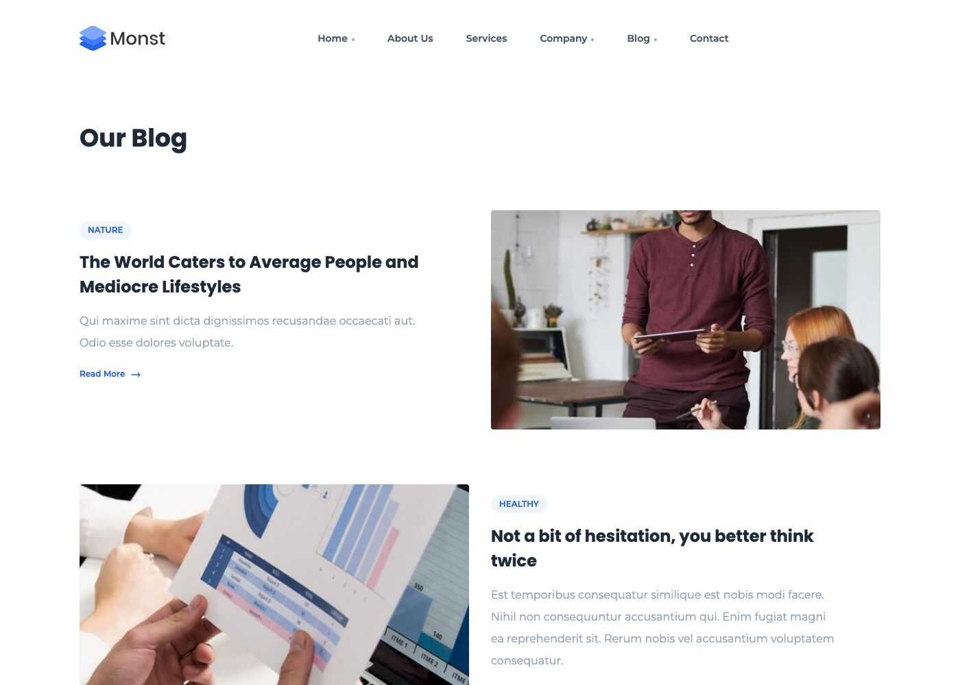
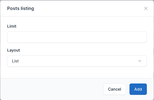
A list of the latest posts. Set the number of posts in Limit (12 when empty) and the Layout (List or Grid). Used on the Category List page.
Overview
Setting
Gallery
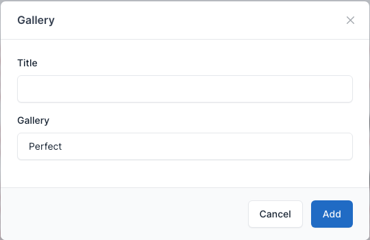
Shows one gallery of the Gallery plugin (Admin -> Galleries): set a Title and pick the Gallery. No demo page uses it; the galleries have their own page at /galleries. See Gallery.
Setting
Theme Galleries
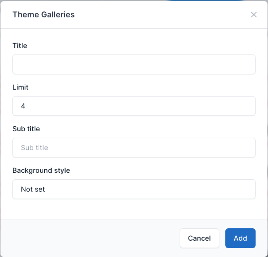
A grid of your latest galleries. Fields: Title, Sub title, Limit (the number of galleries) and Background style. No demo page uses it.
Setting
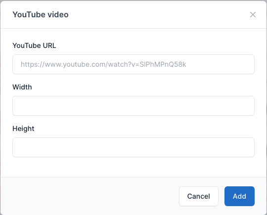
YouTube video
Embeds a video inside a post or page. Paste the YouTube URL and, if you want, a width and height. No demo page uses it. See also Insert video.
Setting
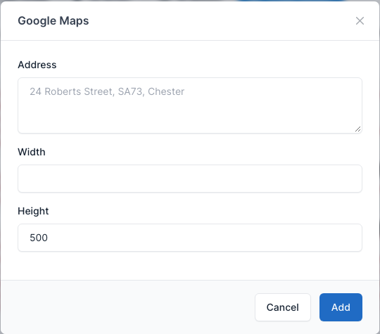
Google Maps
Embeds a Google map for an address. Set the Address, the Width and the Height (500 by default). Used on the Contact page.
Overview
Setting